

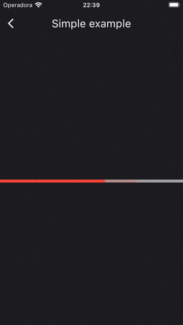
An animated progress bar widget designed to be used with video or audio.
✅ Full control of the animations.
✅ Highly customizable.
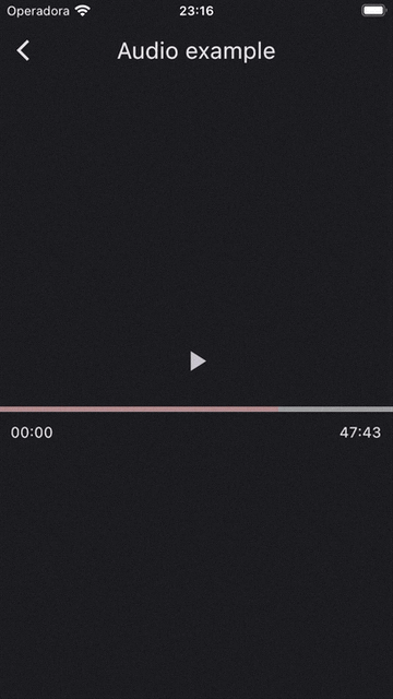
✅ Nothing is clipped on the edges to give a modern aspect (See audio example below).
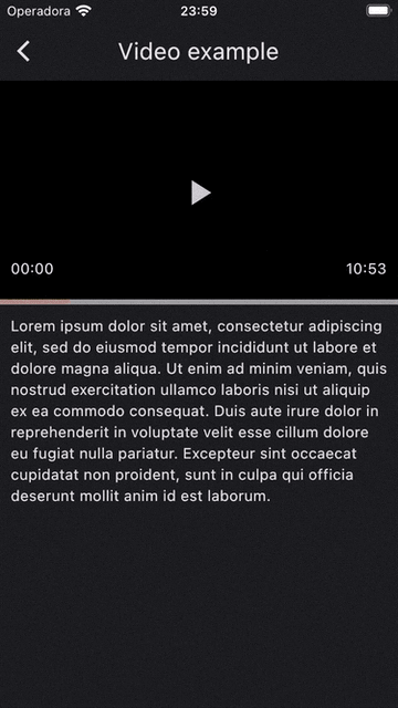
✅ Thumb related components are painted above all widgets to achieve fancy effects (See video example below).
Demo with video and audio:
Keep in mind this widget does not play any media by itself!
class Example extends StatefulWidget {
  const Example({super.key});

  @override
  State<Example> createState() => _ExampleState();
}

class _ExampleState extends State<Example> with TickerProviderStateMixin {
  late final ProgressBarController _controller;

  @override
  void initState() {
    super.initState();
    _controller = ProgressBarController(vsync: this);
  }

  @override
  void dispose() {
    _controller.dispose();
    super.dispose();
  }

  @override
  Widget build(BuildContext context) {
    return ProgressBar(
      controller: _controller,
      progress: const Duration(seconds: 30),
      buffered: const Duration(seconds: 35),
      total: const Duration(minutes: 1),
      onSeek: (position) {
        print('New position: $position');
      },
    );
  }
}First, you need a ProgressBarController to run the animations. Similar to AnimationController, you have to pass a TickerProvider which is configured using the vsync argument on the constructor.
To do so, you can add a TickerProviderStateMixin to your State.
class _ExampleState extends State<Example> with TickerProviderStateMixin {...}Then, add to ProgressBarController:
_controller = ProgressBarController(vsync: this);After that, add the media progress and total durations. You can also add the buffered position of the media.
ProgressBar(
    controller: _controller,
    progress: const Duration(seconds: 30),
    buffered: const Duration(seconds: 35),
    total: const Duration(minutes: 1),
    onSeek: (position) {
        print('New position: $position');
    },
);
Don't forget to dispose the controller when no longer needed.
You can customize the duration of animations as below:
_controller = ProgressBarController(
      vsync: this,
      barAnimationDuration: const Duration(milliseconds: 300),
      thumbAnimationDuration: const Duration(milliseconds: 200),
      waitingDuration: const Duration(seconds: 3),
    );
If you want to go further, the controller gives you full control of the animations:
_controller.forward();                      // Expand bar, wait and then collapse.

_controller.expandBar();                    // Expand the bar.
_controller.collapseBar();                  // Collapse the bar.
_controller.stopBarAnimation();             // Stop bar animation, if running.

_controller.expandThumb();                  // Expand the thumb.
_controller.collapseThumb();                // Collapse the thumb.
_controller.stopThumbAnimation();           // Stop thumb animation, if running.

_controller.expandBar(                      // Expand bar with custom
  duration: const Duration(seconds:1),      // duration and curve.
  curve: Curves.easeIn,
);
The methods that start animations return a TickerFuture object which completes when the animation completes successfully. Which means that you can await for them to finish.
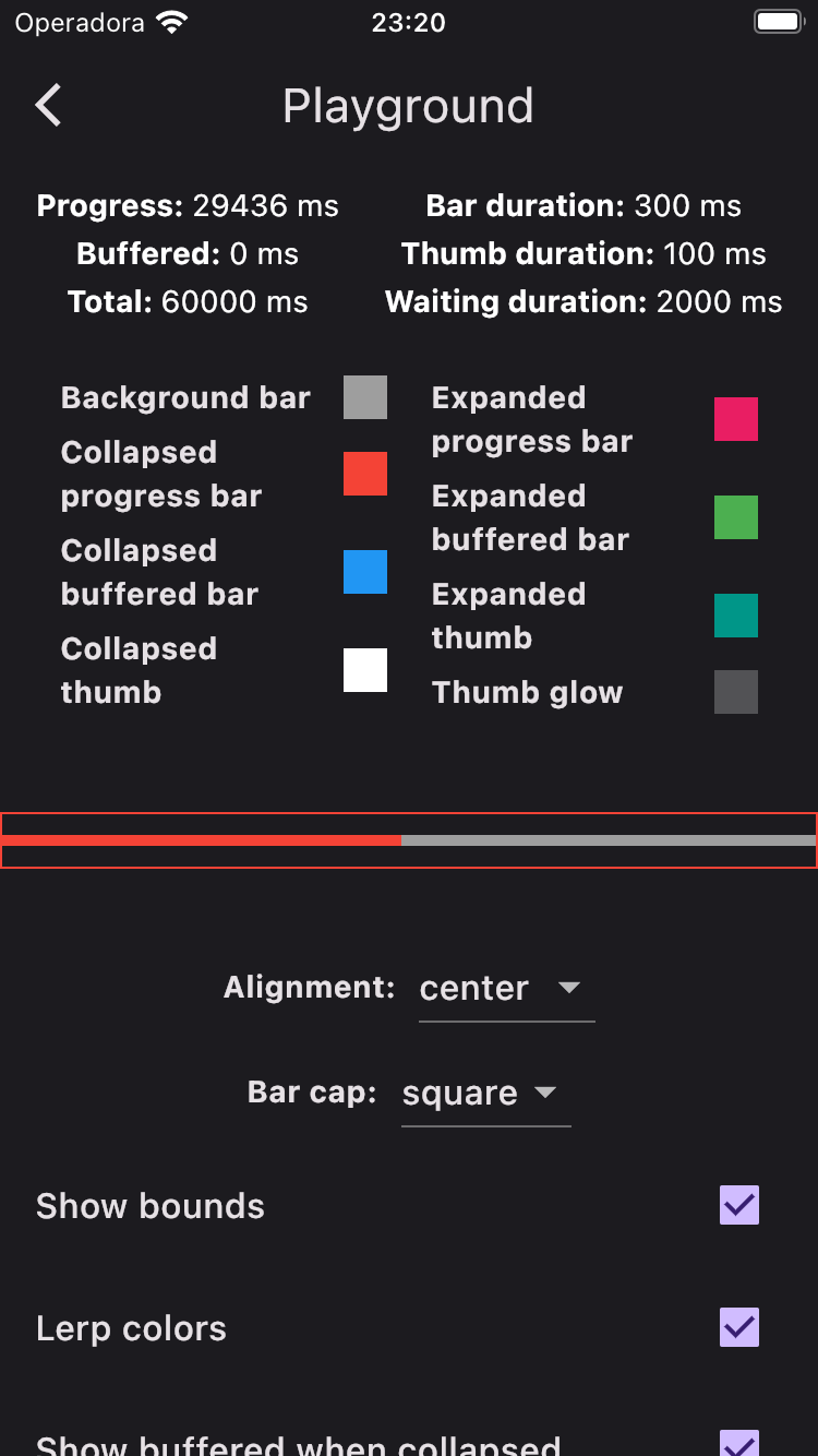
You can customize the ProgressBar with the following parameters:
| Parameter | Type | Description |
|---|---|---|
alignment |
ProgressBarAlignment |
The alignment of ProgressBar relative to it's total size. |
barCapShape |
BarCapShape |
The shape of the bars at the left and right edges. |
progressBarIndicator |
ProgressBarIndicator |
The indicator to be painted. |
collapsedBarHeight |
double |
The smallest size of this bar. |
collapsedThumbRadius |
double |
The smallest size of this thumb. |
expandedBarHeight |
double |
The greatest size of this bar. |
expandedThumbRadius |
double |
The greatest size of this thumb. |
thumbGlowRadius |
double |
The overlay drawn around the thumb. |
thumbElevation |
double |
The size of the shadow around the thumb. |
thumbGlowColor |
Color |
The color of the overlay drawn around the thumb. |
backgroundBarColor |
Color |
The color of the bar in background. |
collapsedProgressBarColor |
Color |
The color of the collapsed progress bar. |
collapsedBufferedBarColor |
Color |
The color of the collapsed buffered bar. |
collapsedThumbColor |
Color |
The color of the collapsed thumb. |
expandedProgressBarColor |
Color? |
The color of the expanded progress bar. |
expandedBufferedBarColor |
Color? |
The color of the expanded buffered bar. |
expandedThumbColor |
Color? |
The color of the expanded thumb. |
lerpColorsTransition |
bool |
Whether colors should be linearly interpolated when transitioning from collapsed to expanded state and vice versa. |
showBufferedWhenCollapsed |
bool |
Whether the buffered bar should be shown when collapsed. |
To quickly try it out all these features, check the Playground:
If you find any bugs, don't hesitate to open an issue!